
How to make a graph in Excel [2026 Guide]
This step-by-step guide shows how to make a graph in Excel, from selecting data to customizing charts, so you can visualize information clearly in 2026.
![How to make a graph in Excel [2026 Guide]](/blog/content/images/size/w1200/2023/02/page-31.png)
Creating charts and graphs is one of the simplest methods to visualize data in a clear and understandable manner.
It's understandable that some folks are terrified by the idea of messing around in Microsoft Excel.
If you are one of those folks then you have come to the right place. In this article, you will learn the simplest way to make a graph in Excel Sheet.
Follow our step by step guide, so you don’t get stuck anywhere.
What are graphs & charts in Excel?
A graph, in simple words, is a pictorial element representation of data in a spreadsheet.
Referring a graph in Excel rather than numbers in a dataset can help you assess the information more effectively.
Take a look at the picture. What can you see?
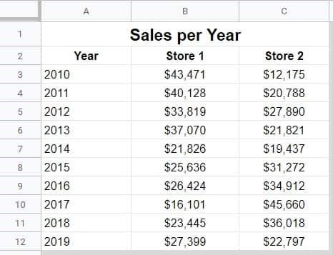
Simple right? A set of data on sales of a company.
But, it seems hard to draw the conclusion from it.
Now, Take a look at the picture below,
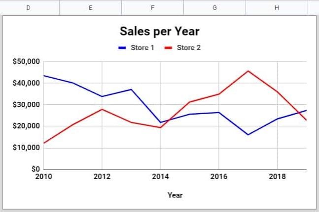
This is giving you a fair idea on how graphs can give you a new perspective.
They also make analyzing data very fast and effective.
Are Graphs and Charts the same?
No, they are not same, they have a slight difference
To represent numerical data, graphs are ideal. Graphs are your best choice for displaying growth rates, sales increases, or other related information.
Whereas, Charts depict how one set of data affects the another. If you need to graphically compare dozens of data points then bar charts and pie charts can come in handy.
However, as we are here to learn How to Create Graphs in Excel, let’s dive right in.
How to build a forms in excel (Step-by-Step Guide)
Steps to make a graph in Excel
Alright then, hope you are ready. Open Excel in your system.
Step 1 - Data Entry
Enter the data that you want to represent into a graph. You can also copy paste any other data that you have.
You can also browse the internet if you don’t want to sit and type the whole thing.
For now, let us consider the following set of data points.
Assume you own an ice cream shop and you are popular for two flavors, Classic Vanilla and Chocolate.
You have the sales data of both the flavors for the year 2020, 2021 and 2022.

Now, if you got the first step right, let's jump to step two.
Step 2 - Choose a graph
Depending on the number and type of data, you can choose the type of graph you wish to go with.
There are a number of charts that Excel Sheet can provide you with, all of them are listed below:
- Line graph
- Column graph or bar graph
- Pie graph or chart
- Combo chart
- Area chart
- Scatter plot chart
Now that you have a fair idea on types of charts, lets see how to select them.
On the top Tab of your Excel sheet you will find “Insert”. You will see all the options of graphs and charts listed above under this tab.
Refer the image below for reference.

Once you decide on the type of graph you want to draw, you can head to the next step. We however are going to tell you how to draw a line and a bar graph.
Drawing line graph in 3 steps
Step 1 - Select the data
The first step is to select the data. Select the whole data like shown in the picture.

Step 2 - Select line chart
Once you have selected the data and go to Insert, now, you will get quite a few options to choose in line charts, select any in 2D.
We are going with the 4th one.

As you select the data you will see a graph

Step 3 - Format data
Formatting is a method of adding nuances to our chart like adding proper headlines, giving your axes names or even changing the color of the graph.
Formatting data is as easy as drawing it.
To change the title all you have to do is Select the Chart Title -> double-click to name -> enter the name you want to give it. Simply tap anywhere outside of the graph's title box and chart area to save it.
As you double click on the title you will see something like this,

The rest of the steps come easily.
You can also increase or decrease the size of the graph by dragging down the lower bottom corner. Vise-versa and you can shrink it too.
You can also change axes labels, change the color of the graph and much more. Stay a bit longer and mess around. It's way easy to learn many other features that excel can provide you.

3 steps to create bar graph in Excel
Well, if you have followed the right steps for making the line graph then, bar graph is going to be way easier for you.
You don’t have to do anything new, if you remember the steps, great! If not, no worries that is why we are here!
Step 1 - Select the data
Selecting data is easy, if you are having trouble with it, just go to the first cell, hold and drag your mouse till the last cell.

We know you have got it, so let's go to step 2.
Step 2 - Select Bar Graph
Once you have selected the data, go to the Insert tab and now look for Bar Graph. If you are having trouble finding it, refer to the picture below.

Select the one in 2D. You know, you can mess around later. First let's get the basics right.
Once you have selected the graph, you see a bar graph, something like shown in the picture below,

You see, bar graphs and line charts have their own unique way of representing things. Depending on suitability, you can choose any.
Step 3 - Format data
Formating data is the same. You can change the title by double clicking on the title box. You can add or remove labels, format plot areas and do much more by just right clicking on the graph.

Limitations of Excel
Drawing a graph on the Excel sheet is as easy as it sounds. But as you work on Excel you will realize, it comes with its own drawbacks.
- Lack of Security
- Slows down the process
- Not suitable for group projects
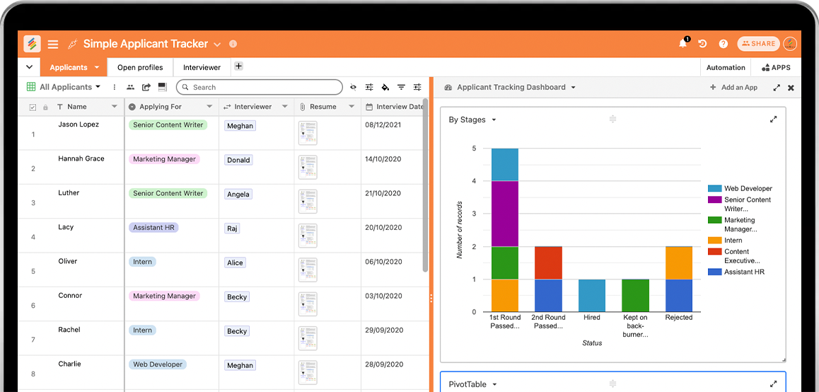
What’s easier, cheaper and better than Excel?
You got it right, it’s Stackby - a no-code spreadsheet-database collaboration platform.
The Charts App on the Stackby App Marketplace includes FIVE distinct chart types: bar, line, radar, donut, and pie.
Simply choose the X and Y axis for your charts & graphs to color details for you. You may even group your charts to make a stacked bar chart. With this easy to use spreadsheet-software, the possibilities are limitless!
Line Chart by Stackby
You can add line charts in your Stackby dashboard. Whether you want to map your records by year, date or status - you can depict them in a line chart easily.
Stackby is more advanced than Excel. Stackby does not slow you down at all. In fact Stackby loads way faster & it’s real-time.
It is also highly secure and you don't have to worry about data theft.
If somehow you lose all your data, Stackby keeps a backup too!
Bar graph by Stackby

Bar Charts/Graphs can be easily added in Stackby. Just select your X and Y axis column types, see if you want to group or stack records by a category or another column type, and that’s it! A stacked bar chart is ready for you to use. Add it to your dashboard and see the changes in real-time.
With Stackby you can make graphs detailed yet it’s very easy to comprehend.
Pie Chart by Stackby
You can also add pie and donut charts in Stackby - to group your records by category, status or more. Visualize it in any way you like.
Conclusion
You can now simply build unique charts for your tables and analyze your data in any matrix with this software. You can also,
- Add rich column types such as Checkboxes, Attachments, Dropdown, Collaborators, Interlink rows with other tables, APIs etc. Here's the overview of all the column types we have.
- Formulas are at the column level, not at the cell level as a spreadsheet. Setup once and see the magic.
- It is relational and easy to use. You can link between tables to create relationships and lookup and aggregate via your linked records.
- Represent your data in different ways in not just Grid but Kanban, Calendar, Custom Forms that you can share and collaborate on and embed anywhere.
- Connect columns with popular third party APIs to automate your work by pulling and pushing information in your tables automatically.
- Organize and build anything you want, your way.
You can definitely work on Excel, but is that really a great tool to work with? You can decide to make the smart choice you know. It's all in your hands now!
Sign up on Stackby for free, import your data from excel or google sheets, customize your database and create your first chart/graph in your dashboard to report like no other.
![A Simple Guide on Workflow Management Software [Updated 2026]](/blog/content/images/size/w960/2021/12/work-management-blog.png)
![Step by Step Guide on How to Build Forms in a Database [2026]](/blog/content/images/2022/03/form-database-blog.png)