
How to create KPI dashboard in Excel [Free Templates & Examples included]
Creating custom KPI dashboards in Excel? Learn step by step how you can create your own KPI dashboards not just in Excel but in databases as well. Bonus free templates inside.
![How to create KPI dashboard in Excel [Free Templates & Examples included]](/blog/content/images/size/w1200/2023/02/page-32.png)
When you want to know about any firm, it is critical to do an analysis based on its Key Performance Indicators (KPIs).
KPIs are significant since they provide a value to compare to your present performance. KPIs clearly show whether or not you are meeting your objectives.
A separate dedicated group is in charge of studying and displaying the results with visual effects.
Dashboards may be created in Excel to measure key performance indicators (KPIs) and delve deeper into data.
In this article, you are going to learn “How to create a KPI dashboard in Excel” so that you can track the growth of your business without any hassle.
Easy 5-step guide to creating a KPI dashboard in Excel
Step 1: Determine the Type of KPI Dashboard You Want to Build
To begin, decide what kind of dashboard you want to construct for yourself and your team. Try responding to specific queries such as:
- What is the dashboard's purpose?
- What are the most likely data sources?
- What metrics should be collected?
- Will this be checked on a daily, weekly, monthly, or quarterly basis?
If the 'objective' of your dashboard is unclear, the entire process will fail to produce actionable results. So, maintaining a firm foundation is preferable than dealing with last-minute outbursts.
Step 2: Open Excel and import the data
Excel is a powerful piece of software. When it comes to KPI dashboard building, it contains just enough tools to get you started. Importing data to Excel in the same context is restricted but sufficient.
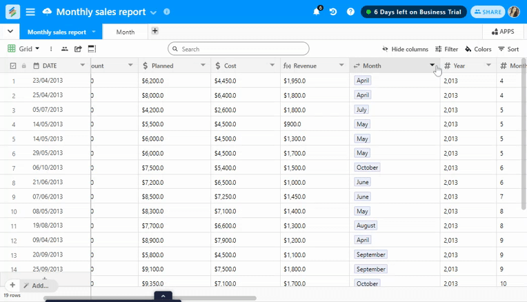
To begin collecting data, open a new Excel worksheet and create a separate sub-sheet for data storage.
You may now wish to pull data from numerous sources for analysis. You may import data from the following sources into Excel:
- Webpages for Microsoft Access databases
- CSV or text files
- Tables on SQL servers
- Analysis cubes for SQL servers
- XML documents
To begin, go to the main menu and select the Data option. Then, in the upper left corner, click the Get External Data icon.

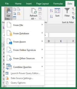
Although you may import data from any source, we'll focus on the most common technique, which is importing data using text or CSV files.
To do so, select From Text / CSV > Choose the File > Select Import.

Step 3: Begin by cleaning and filtering the data
The data that you imported in the previous phase is referred to as raw data. Raw data is not something you want to include on a credible dashboard.
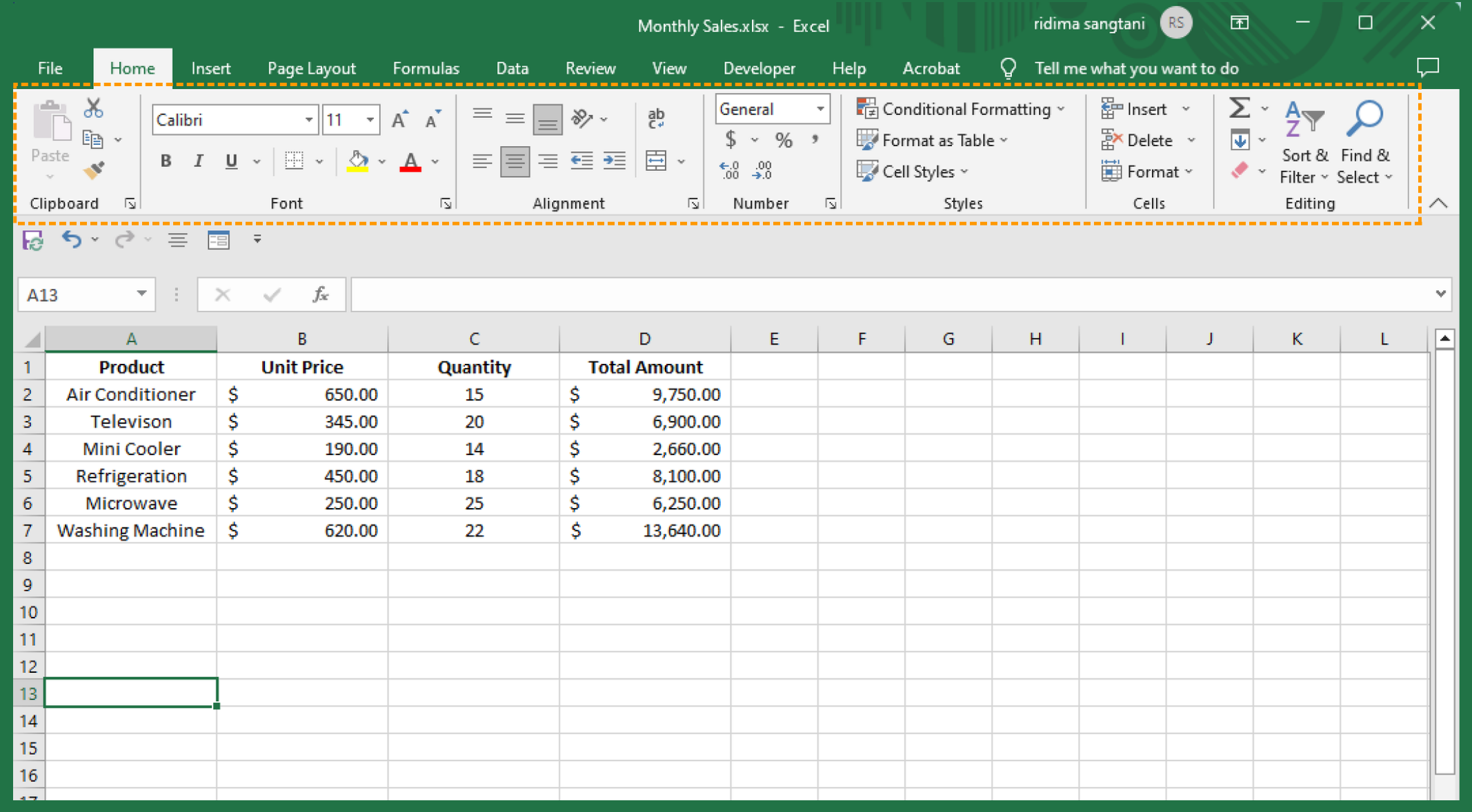
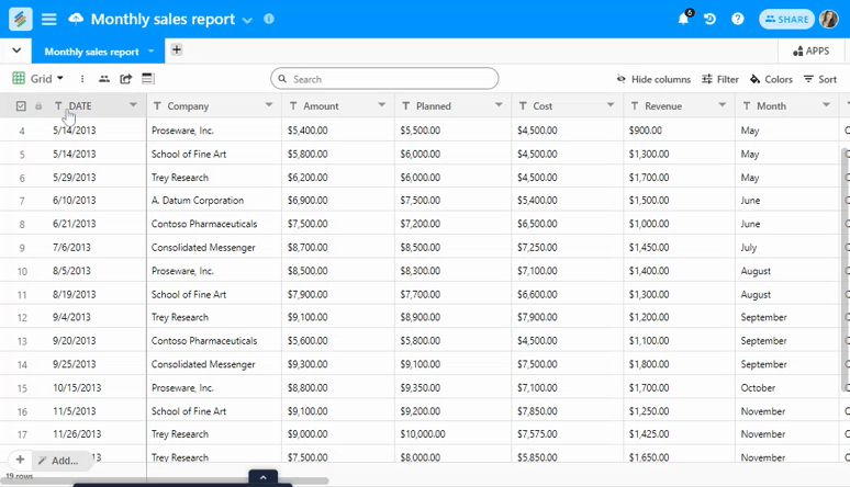
Fortunately, Excel has the capabilities to help you with data purification. For instance, we manually entered a data collection indicating monthly sales.
Excel may help you refine data in the following ways:
- Align your data in ascending or descending order.
- Sorting by Custom: Data may be sorted by column, value, color, font color, and order.
- Data Filtering: For each column, add an advanced filtering widget.
- Delete Duplicates: Removes any redundant data
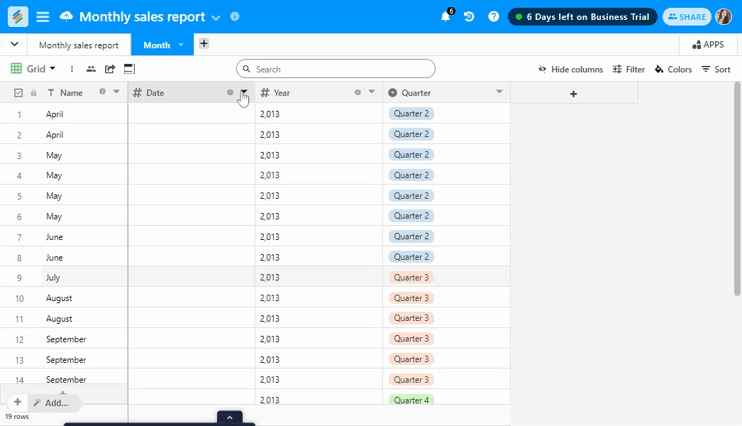
Step 4: Visualize Your Data
We now have factual data. Let's get started with the next big step: data visualizations.
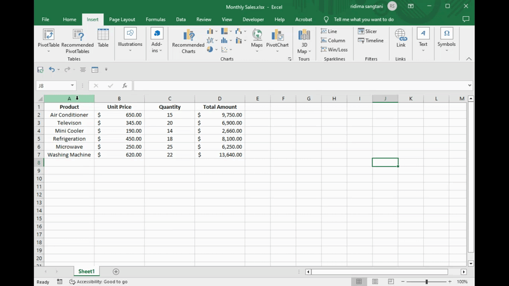
Simply choose the cells you wish to add to the graph and click Insert to exhibit your data in charts and diagrams.
Excel has several chart options, including bar graphs, pie charts, line graphs, and other visualizations. Remember the following when attaching charts to your data:
- Use combination charts to compare numbers and gain useful insights.
- If you want to make choices and have the chart change with them, use dynamic charts.
- When you want to display a trend over time while also saving space on your chart, use sparklines.
Step 5: Create a Full-Fledged Dashboard
Keeping raw data and images on the same page might be difficult, even if you have already worked on visualizing your data.
Make another sub-sheet in the same spreadsheet and label it "KPI Dashboard.
You can track all of the graphs by copying and pasting them onto the new sub-page.
This sheet may serve as a primary KPI dashboard for you and your team. This benefits you in three ways:
- You are given an entire screen to display numerous data visualizations.
- You may specify who has access to/views/edits the raw data sheet.
- If you make modifications or amend the raw data, the key performance indicator dashboard sheet will be instantly updated.
That's all there is to it. You have created a KPI dashboard on the Sheet.

3 Free KPI Templates in Excel
Templates source: GEEK Dashboard
Executive Dashboard Template

Marketing Dashboard Template

Sales Management Dashboard Template

Limitations of Creating KPI Dashboards in Excel
Despite the availability of free KPI templates in Excel, creating dashboards in Excel can be a hard task. Here are a few compelling reasons why people prefer Stackby over Excel.
1. There is no mobile access
Your dashboard is not accessible through mobile.
2. Difficult to Maintain
Excel offers almost little automation. Importing and cleaning your data needs human work, which might take hours at times. Furthermore, physical labor raises the chance of human mistakes.
3. There is no real-time Data accessibility
Excel prevents you from obtaining data in real-time. Even though it is linked to a data source, it does not immediately update your data. As a result, the data in the Excel worksheet is constantly out of date.
4. No Collaborative work
A shared KPI dashboard is always preferable to a single dashboard.
What's the distinction?
While a KPI dashboard allows you to show data visually, a collaborative dashboard allows you and your team to evaluate, monitor, and provide feedback at the same time.
Creating KPI dashboards in Stackby
Creating a KPI dashboard with Stackby is way easier, assuming you will be using the Marketing KPI tracker. Now, just follow the steps below:
Check out our webinar: Build your Custom Marketing KPI Tracker
Step 1: Import CSV, Excel, or Google Sheets to Stackby.
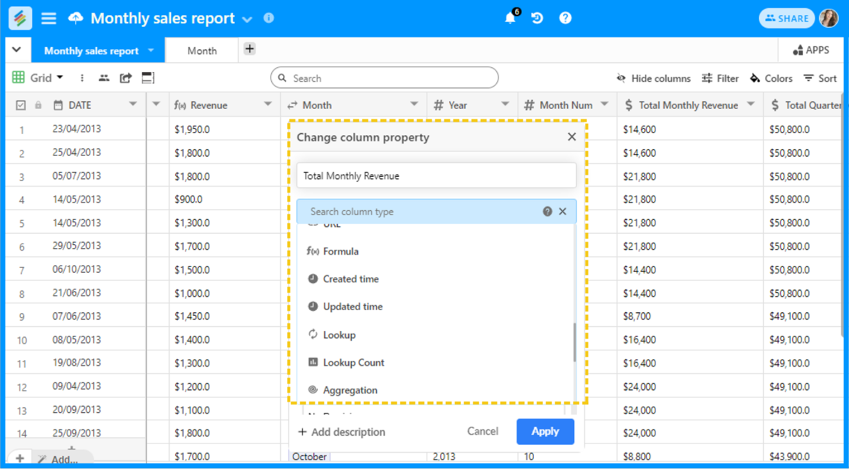
Step 2: Convert the imported columns to different column types (Options, Date/Time, Collaborators, etc.)
Step 3: See if you need to create multiple tables and then link them together (via Link column type).
Step 4: Add Lookup Count or Aggregation fields once two tables are linked together.
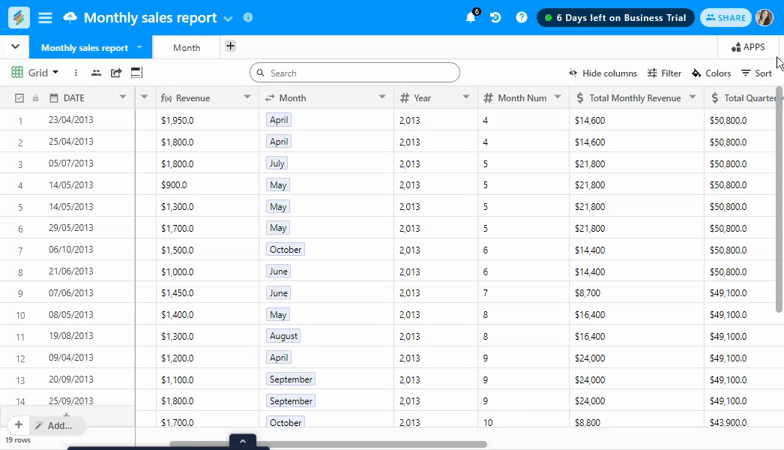
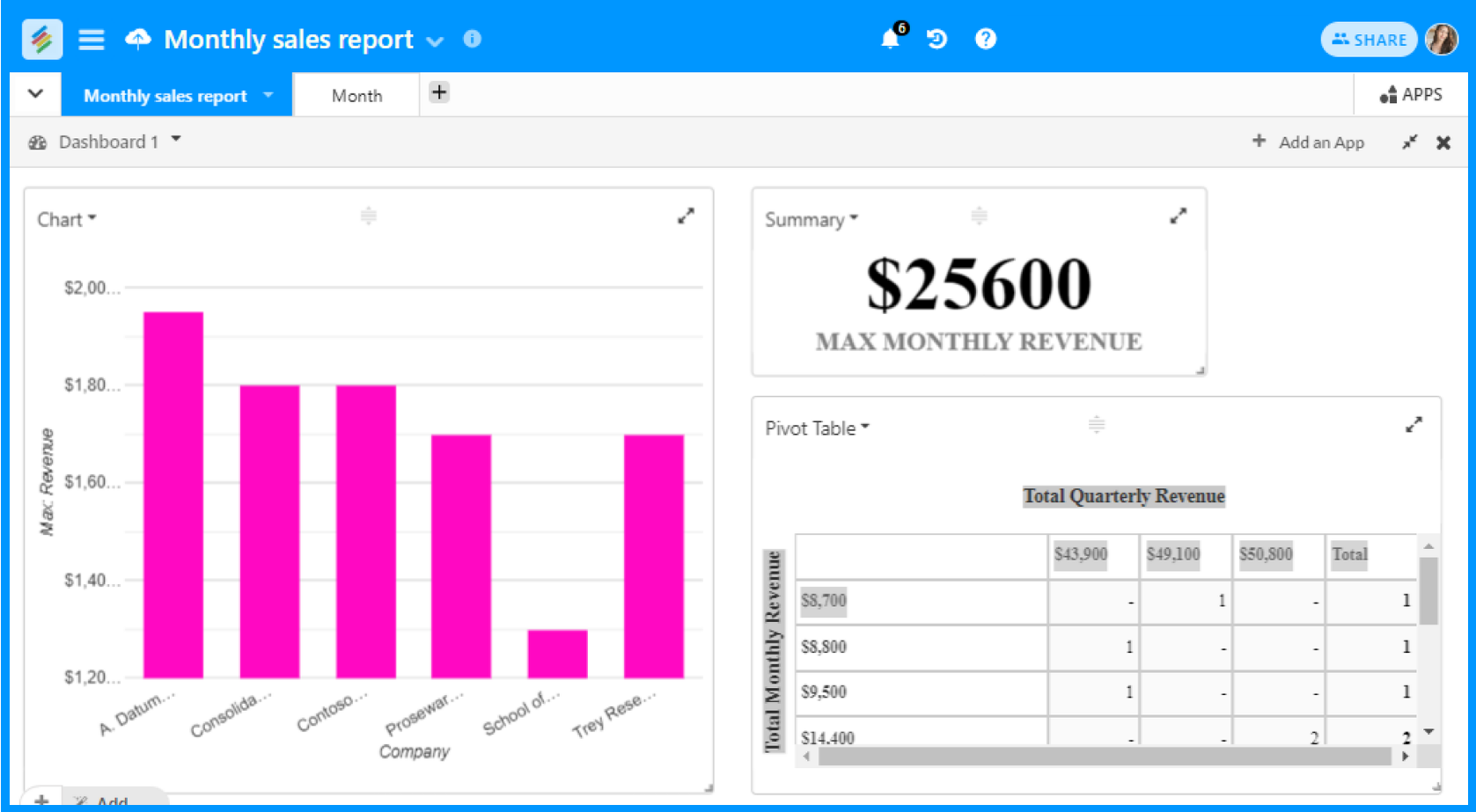
Step 5: Create KPI dashboards with Charts, Pivot Tables, and Summary Boxes with your data.
Step 6: (Optional) Connect column linked API connectors to bring data automatically in tables (via your favorite services - Google Analytics, Google Search Console, etc.)
Conclusion
Stackby is a free KPI dashboard solution that allows you to link data sources and track all of your metrics in a single location.
If you maintain your dashboards in Excel or Sheets, you can use our connection to import all of your data from spreadsheets and create amazing dashboards on Stackby with the Stackby Apps Marketplace.

![A Simple Guide on Workflow Management Software [Updated 2026]](/blog/content/images/size/w960/2021/12/work-management-blog.png)
![Step by Step Guide on How to Build Forms in a Database [2026]](/blog/content/images/2022/03/form-database-blog.png)