How to Create a Dashboard in Excel (Steps and Templates)
Excel dashboards are sure to grab eyeballs when presented at meetings, with neatly formatted charts, pivots, summary boxes for high level decision making & monitoring.

Excel dashboards are sure to grab eyeballs when presented at meetings, with neatly formatted charts, and statistics in the form of dynamic graphs. But that’s not all they’re good for. Simply gathering lots of data about your projects isn’t enough, you need to be able to access it and get a clear understanding of what it’s telling you.
Spreadsheets on their own simply store and perform calculations on the numbers you enter, but to truly get the best insights and analytics from aggregated data, using an Excel dashboard is incredibly helpful.
But for an Excel novice, figuring out how to go about creating a dashboard could be confusing and time-consuming. That’s why we’ve put together a guide to help you create a Dashboard in Excel, step by step.
What is an Excel Dashboard?
Before we get into the guide, let’s take a look at what a dashboard is in Excel and what it does for you.
An Excel dashboard is basically a high-level visual representation of key business metrics, giving you a clearer understanding of what is a dashboard and how it helps in visualizing performance data.
It leverages Excel features like Pivot Tables and Pivot Charts, and allows users to interact with the data to gain better insights which will drive important business decisions.
Dashboards spare you the exact numbers and complicated calculations; those stay under the surface, while presenting the market research data in the dashboard you make. It makes complex data easier to understand using visual depictions like graphs, pie charts, and simple tables.
There’s no one right way to create a dashboard in Excel, and they can be static or dynamic, according to your preference. Static dashboards display data from one particular time period and do not change as the data is updated. Dynamic dashboards reflect changes made to the data and are updated on a daily basis.
Google Sheets Vs Excel: Which is better for you? [2023]
How to Calculate Time in Excel (A Complete Tutorial with Formulas)
Create an outline for your Excel Dashboard
With the variety of features and options on hand, you might get confused or overwhelmed when you jump right into the process of creating an Excel dashboard. You could end up losing track of what you set out to do, so it’s always advisable to define a structure and outline for your dashboard before you start the process of making it.
How to make a graph in Excel [2025 Guide]
Think and come up with answers to these questions to create a solid outline for your dashboard:
1. What is the goal or purpose of this dashboard?
You could be reviewing project targets, tracking expenses, or presenting market research.
2. Which data sets are you going to use to create it?
Check where your data sets are coming from - sales data, your organization’s CRM, surveys, forms, etc. and how easily you can access them.
3. Who is this dashboard’s target audience? What do they want to understand from the data?
The dashboard could be shown to investors or top management. Or you could create one just for your team to review to stay on top of things.
Once you decide the answers to these questions, it’s time to design your dashboard with them in mind.
How to Create a Form in Excel (Step-by-Step Guide)
6 Steps to Create a Dashboard in Excel
Here’s a simple set of steps to follow to create an Excel dashboard:
Step 1: Pull your raw data into Excel
If your data already exists in an Excel spreadsheet, go ahead and skip this step. If not, here are some ways to import data into Excel:
- Simply copy and paste
- Use Microsoft PowerQuery to import data from different sources like CSV files, PDFs, tables, folders, SQL servers, and many more platforms.
- Use an API
Based on your file type, you can choose the most suitable method to import data. Once imported, check for inconsistencies and errors to fix, and clean the data.
Step 2: Set up a structure for your workbook
Keep your dashboard at the beginning of your new Excel workbook, and add one or more worksheets with your data in them. Name your first sheet ‘Dashboard’ and the other tab ‘Data’ for easy reference.
Step 3: Create a table
Creating a table isn’t a mandatory step, but it makes the process of creating charts much more efficient. Tables have the ability to expand as you add new data and perform calculations easily.
First select the data and go to Insert>Table. Excel will automatically create a table, and you can apply your preferred table style. Give your table an appropriate name so you can reference it easily instead of having to select the data range every time.
Step 4: Visualize your data
There are many ways to analyze your data on Excel, and you should go for the option that suits the overall goal for the dashboard. Here are the commonly used methods of visualizing data:
- Pivot Table
- Charts
- Excel Formulas
- Conditional formatting
Pivot tables are the most useful method for the purposes of a dashboard, as they let you sort, group, count, and add up data in a table.
Step 5: Create a Pivot Table
Use a new worksheet on Excel to do this, since it can take some time to figure out properly. In the worksheet, go to Insert>PivotTable, and enter the name of your table.
Arrange the table fields depending on what you want to see. Now you can insert a PivotChart based on the PivotTable. You could also go with a pie chart, bar graph, Gantt chart, waterfall chart, stacked column chart, line graph, and more.
Continue creating more tables on new worksheets, to display all the key metrics you’re looking for. Make sure to name each worksheet for easy identification.
Step 6: Assemble your Dashboard
Now that you have all the charts and metrics ready, it’s time to bring them together into a cohesive dashboard to display. Go to your ‘Dashboard’ worksheet, copy all the charts from the other sheets and paste them onto the dashboard sheet. Arrange them so they look neat and comprehensible. Group related metrics together and avoid clustering too much information.
Apply formatting to give your dashboard a better look, and customize the font, colors, layouts, etc. of your charts. If you want an interactive dashboard, include dynamic charts, where the data is automatically updated as you modify it in the table.
You could also add interactive features like macros and slicers. Here’s a short explanation on how to make Slicers:
Slicers
Go to the PivotChart you want, in the PivotTableAnalyze tab, insert a Slicer. Select the fields you want to display and arrange the slicer wherever you want. You could also format it using the Slicer tab.
5 Free Excel Dashboard templates
You could always bypass most of these tedious steps by going for a pre-made dashboard template. That’s where we’ve got you covered with these free Excel Dashboard templates:
Excel KPI Dashboard template
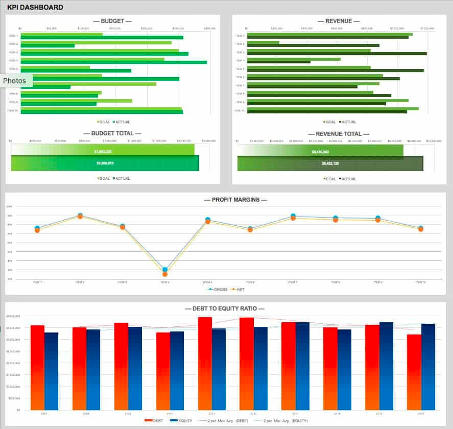
Click here to download this free Excel KPI dashboard template.
Project Management Dashboard template
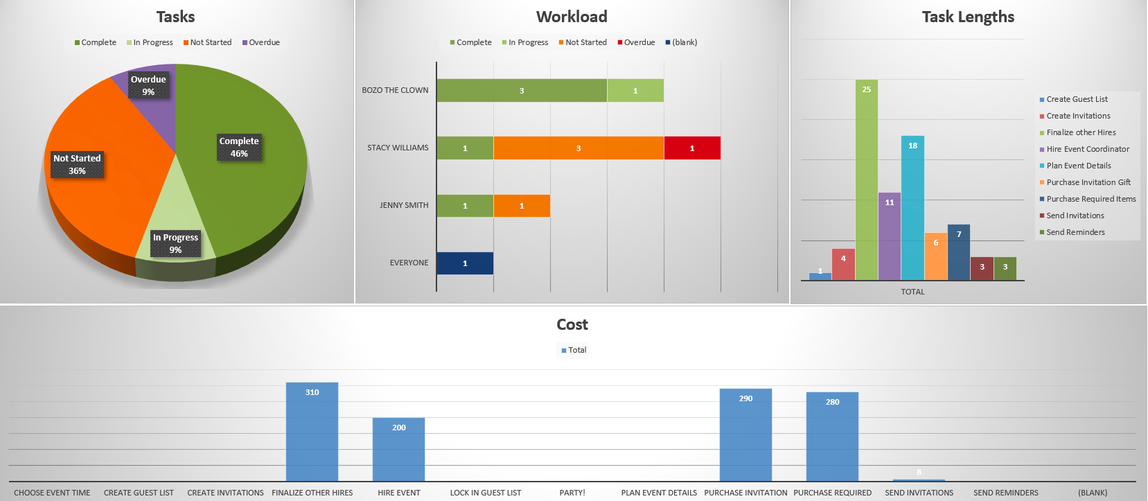
Click here to download this free Excel project management dashboard template.
Sales Dashboard template
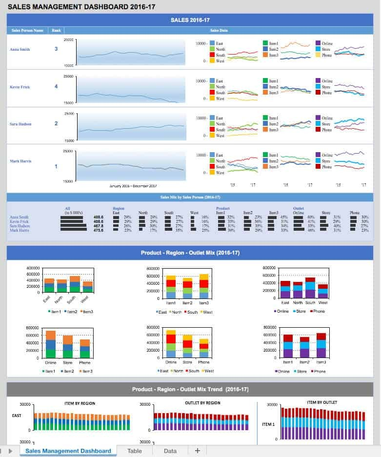
Click here to download this free Excel sales dashboard template.
Financial Dashboard template
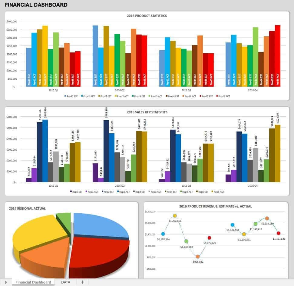
Click here to download this free Excel financial dashboard template.
Social Media Dashboard template
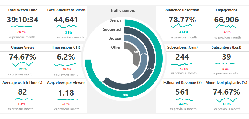
Click here to download this free Excel social media dashboard template.
Limitations of Excel Dashboards
Excel dashboards are relatively simple, cost-effective, and visually appealing. But that doesn’t mean they’re flawless. Here are some common drawbacks of using Excel to create dashboards for your data:
Requires a lot of manual work
All your data has to be manually entered into Excel. It takes time to import, clean, and analyze the data, before even creating a dashboard. This makes it time-consuming and may not seem like it’s worth the effort.
Susceptible to human error
The more data you handle, the greater the possibilities of committing errors. From simple typos, to overlooking omissions or misentered data, the capacity for human error is high with Excel. That means you might end up creating a fancy looking dashboard that is actually riddled with mistakes.
Difficult to collaborate
If you use Excel as your only tool to display and share your business data, it becomes difficult to ensure that all stakeholders are viewing the exact same version of the data on the dashboard. This makes it hard to discuss and make decisions collaboratively.
Lack of integration
One of Excel’s major limitations is that it does not offer direct integrations with other apps or software. Multitasking with other apps is tedious, unless you use a third party integration app to do so. Even then, you’re stuck using two more apps than you absolutely need to.
Security risks
Anyone with access to an Excel dashboard also has full access to all the data in it, since Excel does not offer much in the way of data security. That means sensitive information from your organization is at risk when shared back and forth across channels and between devices.
Despite its limitations, Excel remains the most used and trusted business tool worldwide, as it does offer many useful features and is cost-effective as well. However, as you scale your business, it’s worth investing in a single platform that allows you to automate dashboard creation, gain deep insights, and integrate with multiple apps.

![A Simple Guide on Workflow Management Software [Updated 2026]](/blog/content/images/size/w960/2021/12/work-management-blog.png)
![Step by Step Guide on How to Build Forms in a Database [2026]](/blog/content/images/2022/03/form-database-blog.png)

