
Gantt Chart Templates: How to Build One That Actually Keeps Projects on Track
Gantt chart templates make it easier to organize tasks, deadlines, owners, and dependencies in one visual timeline. This guide covers how to create a Gantt chart in Excel, compares popular tools, explains useful template types, and explores how Stackby simplifies project scheduling.
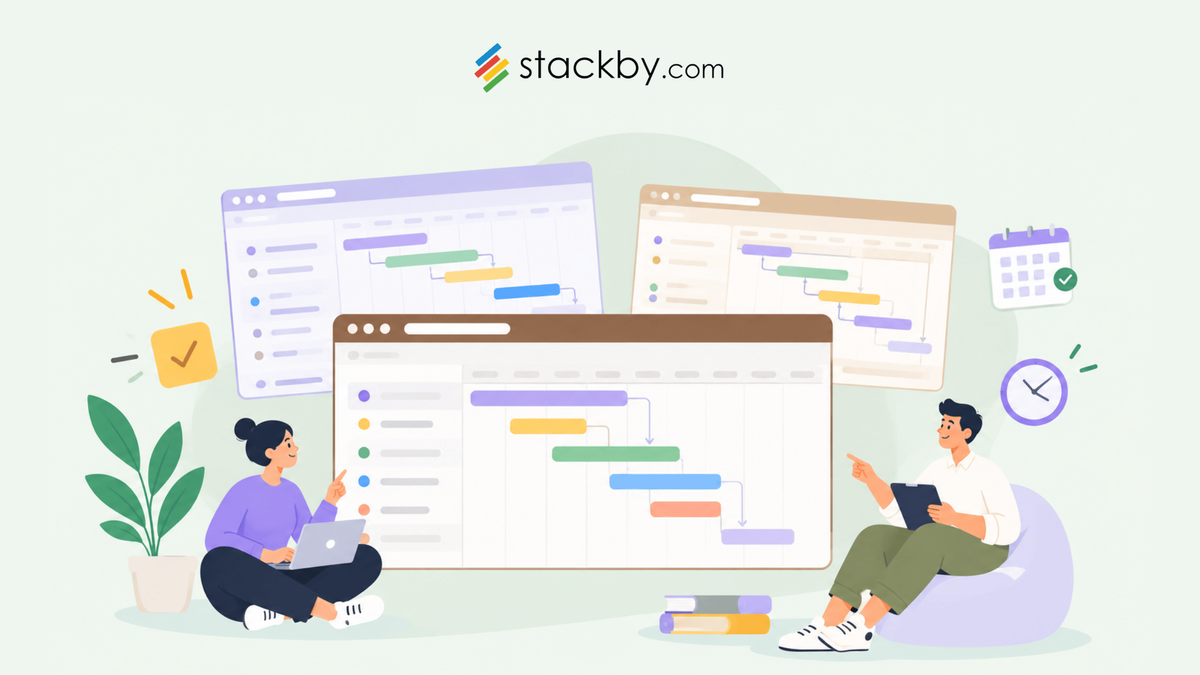
Most project plans start strong and fall apart by week two. Tasks are scattered across spreadsheets, Slack threads, and one person's notebook. Nobody's sure who owns what. The deadline is closer than it looks.
That's where gantt chart templates come in. A good one gives your whole team a shared visual of who's doing what, and when, without anyone needing to build it from scratch. No complicated setup. No hours lost formatting cells.
This post covers what to actually include in a gantt chart, how to make one step by step in Excel and beyond, a real tool comparison with actual numbers, and how Stackby handles all of this if you're tired of rebuilding the same spreadsheet every project. Whether you're managing a product launch, a client campaign, or a website migration, there's a template approach here that fits.
Teams managing SEO projects can also use Stackby's SEO templates to organize content tasks, assign owners, and track deadlines across campaigns.
For client projects that involve customer records or sales activities, Stackby's sales and CRM templates can help connect project-related work with client information.
Whether you need a simple schedule or a dependency-heavy project plan, the right Gantt chart templates can help you organize tasks, visualize deadlines, and keep project updates in one place.
What Is a Gantt Chart, and Why Do Teams Actually Use Them?
You probably know the basics. A Gantt chart maps tasks to a timeline using horizontal bars. Left column is tasks. Top row is dates. Each bar shows when a task starts, how long it runs, and when it ends.
Simple in theory. But here's why it works in practice: it makes dependencies visible.
When you can see that "write copy" starts Monday and "design mockup" is blocked until copy is done, you immediately understand why a three-day writing delay pushes everything back a week. Without a chart, that logic lives in someone's head. On a chart, it's obvious.
Teams use them for software launches, construction schedules, marketing campaigns, event planning, and ongoing client work. Basically any situation where multiple people are working on connected tasks over days or weeks.
Marketing teams managing product launches and campaigns can explore Stackby's marketing templates to organize deliverables, campaign tasks, and important deadlines.
Stakeholders love them too. Drop a Gantt chart into a client meeting and they understand your project timeline immediately, no explanation required. That alone is worth something.
What Should a Good Gantt Chart Template Actually Include?
Not all templates are equal. A lot of free options look polished but skip the fields that actually matter. Here's what a useful one needs:
Task names and descriptions
Sounds obvious, but templates with generic "Task 1, Task 2" placeholders are annoying and easy to misuse. You want room for real task names and a short description field.
Start and end dates
Both. A start date alone tells you nothing about workload or timeline overlap.
Task owner
Who is responsible? This is the most commonly skipped field in free gantt chart templates, and the single biggest reason tasks fall through the cracks on shared projects.
Progress tracking
A simple percentage or status field (Not started, In progress, Done) is enough. You want a quick read on whether something is on schedule or slipping.
Dependencies
Which tasks need to finish before another can start? Many templates show bars without links between them. That's a significant gap for any project with connected deliverables.
Gantt charts are one part of effective scheduling. For a broader look at organizing tasks, dependencies, and deadlines, explore this guide to project schedule management .
Milestones
The non-negotiable dates. Product demo on the 20th. Client review on the 28th. They should stand out visually, not blend in with regular task bars.
Miss two or three of those and the chart looks professional but doesn't actually help you run a project.
How to Make a Gantt Chart in Excel (Step by Step)
Honestly, gantt chart Excel setups are more work than most people expect going in. They're free and familiar, so project managers default to them anyway. Fair enough. Here's how it works.
Step 1: Set up your task table. Column A is task names. Column B is start date. Column C is end date. Column D is duration, calculated with =C2-B2. Column E is task owner.
Step 2: Insert a stacked bar chart. Select your task names and start dates, then add a 2D stacked bar chart. Add the duration column as a second data series.
Step 3: Make the first series invisible. The chart shows two bars per task. The first bar (representing the start offset) needs no fill and no border. That creates the floating bar effect that makes it read like a real Gantt chart.
Step 4: Format the date axis. Excel displays dates as numbers by default. Right-click the horizontal axis, format it as a date, and set your minimum and maximum values to match your project's actual start and end dates.
Step 5: Layer on progress tracking. This is where it gets fiddly. You'll need additional rows, helper formulas, or conditional formatting to show percentage-complete within bars. There's no built-in way to do it cleanly.
If you know what you're doing, this takes about 45 minutes. If you don't, it's three hours with YouTube tutorials running in other tabs.
And once it's built? The bigger problem is maintenance. Updating cells manually every week, dragging bars when timelines shift, fixing formula references when you add a new task row - it adds up fast. A pre-built template in Excel cuts the setup time significantly. But if your projects are more than 15-20 tasks or involve multiple collaborators, it's worth considering a dedicated tool instead.
Types of Gantt Chart Templates Worth Knowing
Different projects need different layouts. Here's a quick breakdown:
Simple task template
One row per task, bars on a weekly grid. Works well for projects with 10 to 20 tasks and no complex dependencies. Best starting point for anyone new to Gantt charts.
Milestone template
Adds a separate visual layer for key dates. Great for client presentations or executive status updates where you want to highlight deliverables without showing all the task-level detail.
Dependency-linked template
Arrows or lines connect tasks to show which ones are blocked by others. Harder to build in Excel. Much easier in dedicated tools that handle the logic for you.
Sprint template
A weekly Gantt broken into two-week sprint cycles. Used by dev teams running Scrum, though it works well for any team doing time-boxed work. Underused outside engineering, honestly.
Resource view template
Rows represent team members instead of tasks. You can see immediately who's overloaded and who has capacity. Underrated for managers who need to balance workloads, not just track deadlines.
If you want a ready-made starting point, explore Stackby's project management templates for project trackers, task management, resource planning, and Gantt-related workflows.
If you're new to using templates, this guide explains how to choose a Stack from the template gallery and customize it for your team's workflow.
Start with the simple task template. Graduate to dependency tracking once your projects get complex enough to actually need it.
Teams that prefer to customize an existing setup can browse the Stackby template gallery and choose a starting point for their project scheduling workflow.
Gantt Chart Template Comparison: Excel vs. Google Sheets vs. Stackby vs. GanttPRO
Here's an honest look with real numbers:
Excel is the incumbent for a reason. It's already installed, the templates are everywhere, and there's nothing new to learn. But real-time collaboration is clunky at best, dependencies have to be tracked manually, and pulling data from another source means formula chains that break every time someone renames a tab. That's genuinely frustrating once you're maintaining a real project.
If manually formatting Gantt charts in spreadsheets becomes difficult to maintain, Stackby's Timeline View offers another way to organize tasks, schedules, and deadlines visually.
Google Sheets improves the collaboration part. The same structural limitations apply though. Neither tool was built for project management. They're spreadsheets filling a role they weren't designed for, and you feel it.
Stackby occupies an interesting spot: database-powered like Airtable, as approachable as a spreadsheet, and with native Gantt views without the per-user pricing jumps that make enterprise tools painful to scale for small teams.
Gantt charts are particularly useful when they are connected to a broader project tracking workflow. This guide on creating a custom project tracker explores how teams can organize project information and visualize progress using different views.
How Stackby Helps With Gantt Chart Templates
Stackby is built around the idea that most teams are stuck somewhere between "spreadsheet is too basic" and "enterprise project tool is overkill." It combines spreadsheet-style views with actual database structure, which matters more than it sounds once you're managing real projects with real dependencies and multiple contributors.
For Gantt work specifically, here's what it does well:
Built-in Gantt view
You don't build a chart from scratch. Switch any table to Gantt view and your tasks render visually as a project timeline, pulling from the start and end date fields you already have. No stacked bar chart formatting. No axis tweaking.
Custom fields that carry across views
Priority, owner, status, dependency - define them once and they appear across every view: table, board, Gantt, calendar. No reformatting when you switch context.
Stackby's Timeline View provides a way to organize time-dependent records across days, weeks, months, or longer project periods.
Automations that reduce manual updates
When a task status changes, Stackby can trigger a Slack notification, update a related field, or move a record automatically. That's real time saved, especially if you're the person sending status-check messages every Monday morning.
Timeline management becomes more efficient when routine updates happen automatically. Learn more about Stackby's internal automations and how they can support status changes, notifications, and recurring workflows.
API and app integrations
Connect your Gantt data to Google Sheets, HubSpot, Typeform, or dozens of other tools. Your project data doesn't need to live in a silo.
Teams exploring AI-supported workflows can review Stackby's AI-powered templates for ways to incorporate AI into structured project and operational processes.
Ready-to-use templates
The template library has pre-built project management setups you can customize in minutes. It's a solid starting point if you want a free gantt chart experience without the Excel overhead or formatting work.
Pricing is genuinely reasonable. The free plan gives you enough to evaluate it properly, and paid plans start at a level that doesn't punish small teams. Compare that to tools charging $25-30 per user per month and the math gets simple.
If you're still rebuilding project timelines in spreadsheets each quarter, give Stackby a proper look.
And, If your team needs more than a static chart, you can also explore how to build a project tracker app without coding and connect project information with custom views and workflows.
When to Use a Gantt Chart (and When to Skip It)
Gantt charts aren't the answer to every project. They solve a specific problem.
Use one when:
· You have more than five tasks with real dependencies between them
· Multiple people need to see who owns what and by when
· You're working toward a fixed external deadline with milestone check-ins
· A client or stakeholder needs to review and sign off on a project timeline
Skip it when:
· Your project is two or three tasks with no moving parts
· You're still in early planning and tasks aren't defined yet
· You're running a recurring operational process where a checklist is genuinely faster
The most common mistake: teams build an elaborate chart for a three-week project that could've been a shared to-do list. The chart becomes the work instead of supporting the work.
A template becomes more useful when its views match the way your team works. Explore Stackby's guide to customizing your Stack and its views to learn more about organizing project data.
Common Mistakes That Kill Gantt Charts in Practice
A few patterns that come up repeatedly:
Building it once and never updating it
A chart that reflects week-one planning and never changes is basically a screenshot. It needs to stay current. If a task slips, update it. A chart that looks healthy while the project falls behind is worse than no chart.
Too much granularity
When every deliverable is broken into 15 sub-tasks at the hourly level, the chart becomes unreadable. Keep tasks meaningful - ideally two days to two weeks of effort each. Anything smaller belongs in a task checklist, not a Gantt.
No task owner attached
"Marketing collateral" as a task with no name next to it means everyone assumes someone else is handling it. Every row needs a person.
No buffer time
Projects run late. Not because people estimate badly, but because things come up. A day or two of padding between dependent tasks can prevent a full cascade when one thing shifts unexpectedly. Build it in deliberately.
For projects that require recurring updates and deadline reminders, automation-enabled Stackby templates can provide a starting point for building more efficient workflows.
Wrong tool for the scale
Building a dependency-heavy six-month product roadmap in Excel is possible. It's also a maintenance headache waiting to happen. Match the tool to the project.
Frequently Asked Questions
What is a gantt chart template used for?
A gantt chart template gives you a pre-built structure for mapping project tasks to a timeline. You fill in your specific tasks, dates, and owners, and the visual format is already handled. It saves setup time and makes sure you don't skip key fields like dependencies or task ownership.
Where can I find a free gantt chart template?
Several places: Stackby's template library, Microsoft Excel's built-in gallery, Google Sheets, and Smartsheet all offer free options. Stackby includes a native Gantt view on its free plan, so you don't need to download a file or format a chart manually - it's built into the tool itself.
How do I make a gantt chart in Excel without starting from scratch?
Search Microsoft's template gallery for "Gantt chart" and you'll find several ready-made options. Download one, open it in Excel, replace the sample tasks with your own, adjust the date range, and update bar formatting if needed. It's faster than building the stacked bar chart manually, but still requires manual updates every time your project shifts.
What's the difference between a Gantt chart and a project timeline?
The terms overlap constantly. A project timeline is the broader concept - any visual representation of project phases and dates. A Gantt chart is a specific format using horizontal bars to represent task duration mapped against a date axis. In practice, most people use both terms to mean the same thing, and in most conversations they do.
Can I use Google Sheets instead of Excel for a Gantt chart?
Yes. The process is similar to Excel and real-time collaboration is much smoother. Free templates are available. The limitation is the same as Excel though: dependencies aren't tracked natively, and updating bars manually gets old on longer projects. If you need more than a static visual, a dedicated project timeline tool handles this cleaner.
How many tasks is too many for one Gantt chart?
Charts start getting hard to read past 50 to 60 tasks in a single view. If your project is larger than that, consider grouping tasks into phases and creating both a high-level summary chart and a detailed one. Two clean charts are more useful than one that requires horizontal scrolling to read.
Conclusion
Gantt charts have been around since 1910. They've lasted this long because the core format is genuinely useful for understanding how a project moves through time. The template you use and the tool you use to maintain it - that's where most teams either get it right or waste hours every week on manual busywork.
Start simple. Update regularly. And if you're still rebuilding project charts from scratch in a spreadsheet every quarter, it's worth spending 30 minutes with Stackby to see how much of that work you can cut out.