How to Create Google Sheets Dashboard ? [3 Simple Steps]
Using Google sheets to manage your data and organize your workflows? Learn how you can create your custom google sheets dashboards in 3 simple steps!
![How to Create Google Sheets Dashboard ? [3 Simple Steps]](/blog/content/images/size/w1200/2024/02/google-sheets-dashboard-1.jpg)
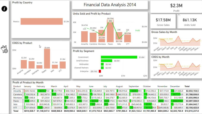
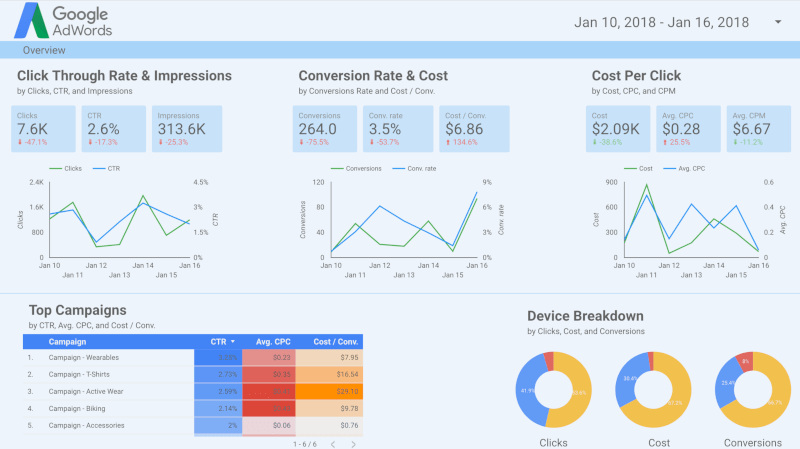
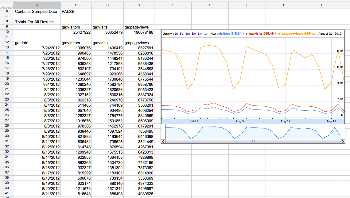
The Google Sheets dashboard offers a dynamic and intuitive platform for analyzing and visualizing data. It empowers users to glean insights effortlessly. Through customizable graph charts and tables, it presents a comprehensive snapshot of key metrics and trends. Whether tracking sales performance, accessing project milestones, or monitoring website traffic, the dashboard provides real-time updates and interactive features for seamless data exploration.
With the flexibility of Google Sheets, users can easily manipulate and update data sets, ensuring that the dashboard reflects the latest information.
- It is the most popular online spreadsheet application globally, surpassing Microsoft Excel in terms of active users.
- There are over 1 billion monthly active users of google sheets.
What is a Google Sheets dashboard ?
By using google sheet dashboard you can track and visualize your data from multiple sources.
You need just one click and you can import your data from spreadsheets and create tables, graphs, charts to check business insights of your projects. Also you can set up automated notifications, informed about modification of your business data. This will able to identify current trends and change necessary things as per needs.
Google Sheet as Database : Pros & Cons
These dashboards are often used by businesses, individuals, and organizations to track performance, identify trends, and gain insights into their data without the need for specialized software or programming skills.
A Beginner Guide : What is Database in 2024
How to create Google Sheets ?
Data preparation
Before you start building your dashboard, it is necessary to have well-organized and clean data. Ensure that your data is in a structured format with clear headers. Google Sheets allow easy access to data from various sources, which makes it convenient to manipulate and analyze. A well-prepared data set forms the foundation for meaningful insights.
Select the Key Matrix
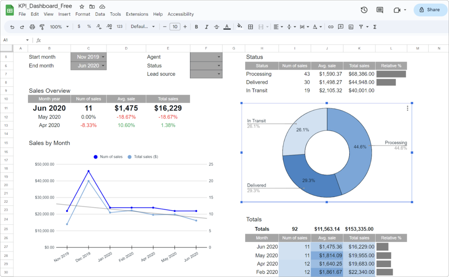
Identify the specific metrics and key performance indicators that align with your objectives. Whether it is a sales figure, website traffic, or any other relevant data, pinpointing your key metrics can help in focusing your analysis. They will be the cornerstone of your dashboard, providing a snapshot of the most critical aspects of your data.
Create data visualizations
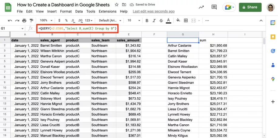
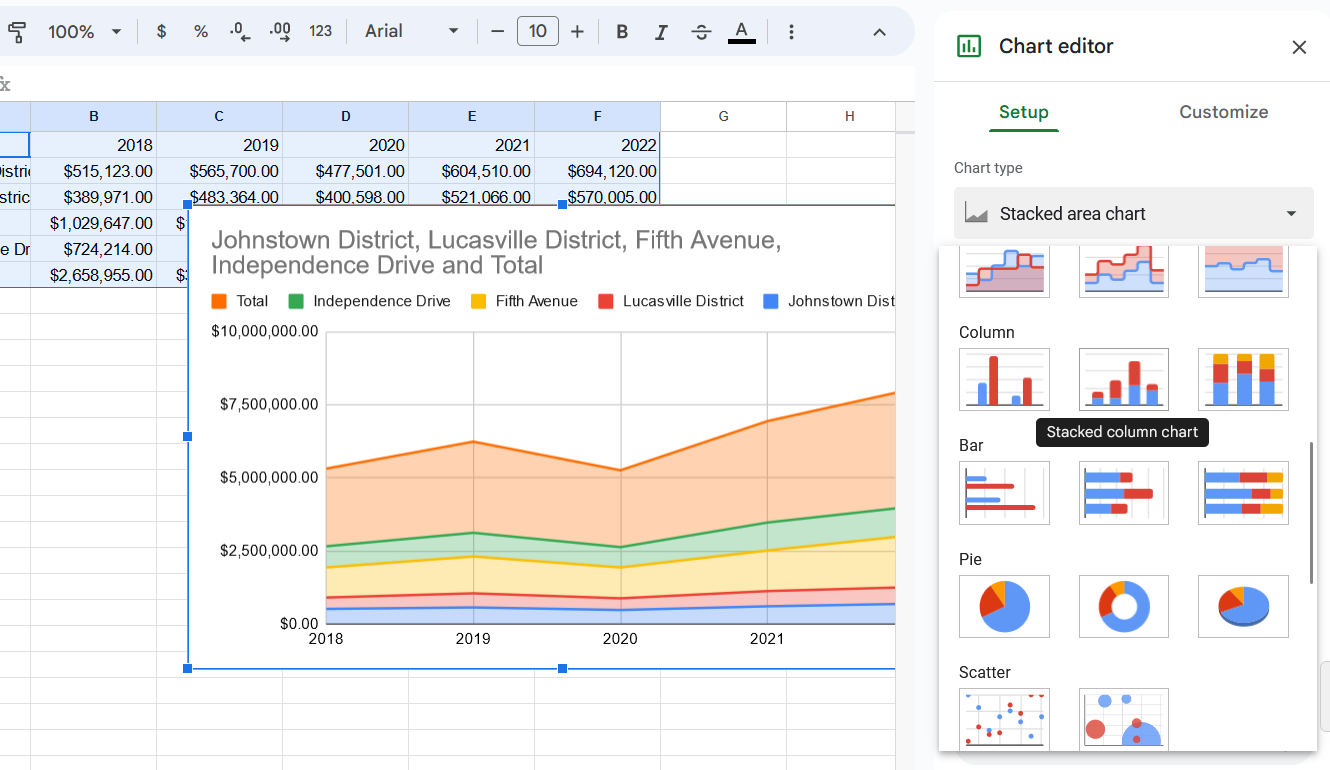
Google Sheets offers a variety of built-in charts and graphs to help you visualize your data effectively. It totally depends on the nature of your data and how you can use line charts to show trends over time, bar graphs for comparisons, and pie charts for illustrating proportions. Visualizations make it easier for stakeholders to grasp complex information at a glance.
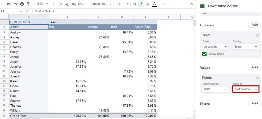
Utilize Pivot Tables
Pivot tables are one of the powerful features in the Google Sheets dashboard that are used for summarizing and analyzing large data sets. They allow you to recognize and manipulate the data to extract meaningful insights. By incorporating pivot tables into your dashboard, you can provide a dynamic view of your data that will enable users to explore various dimensions easily.
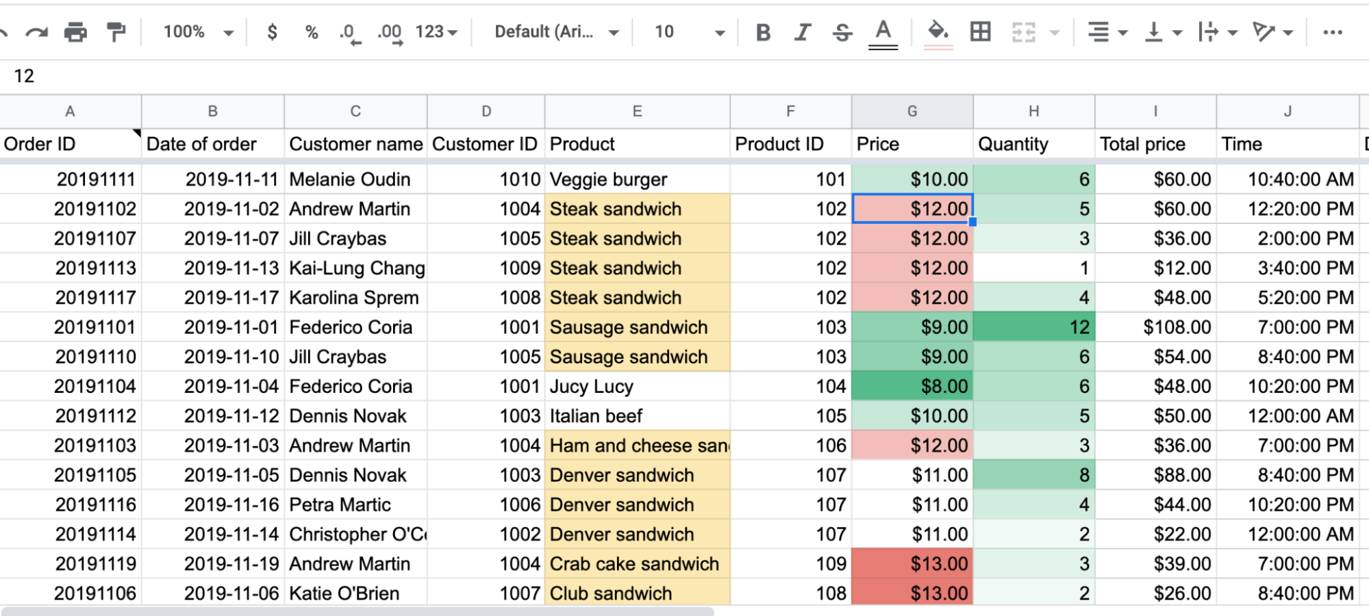
Incorporate conditional formatting
You can enhance the visual appeal of your dashboard by using conditional formatting. This feature allows you to highlight the cells based on specific conditions, making it easier to identify outliers, critical data points, and trends. A visually engaging dashboard is more likely to capture the attention of users and convey information effectively.
Design and layout
The design and layout of your dashboard play a crucial role in the user experience by arranging visual elements logically to guide users through the information seamlessly. Use consistent color schemes and fonts to maintain a professional and cohesive look. A well-designed dashboard assures that the user can quickly navigate and understand the presented data.
Interactivity with filters
Enhance the user's ability to interact with data by incorporating some of the filters in your dashboard. These filters allow users to focus on specific subjects of data and provide a more personalized yet dynamic experience. This interactivity empowers stakeholders to explore different scenarios and get a deeper look inside the information presented on the dashboard.
Integration with Google Data Studio
For some more sophisticated dashboards, you can consider integrating Google Sheets with Google Data Studio. It allows for the creation of interactive and shareable reports with advanced visualization options. This integration provides a seamless transition from the basics of spreadsheet dashboards to more comprehensive and visually appealing reports.
Automation with Google Apps script
Take advantage of the Google Apps script to automate repetitive tasks and customize the functionality of your dashboard. This scripting language allows you to add dynamic features, automate the data update, and extend the capabilities of Google Sheets. The automation saves time and ensures that your dashboard reflects the most current data.
Regular updates
Keep your dashboard relevant by regularly updating and underlining the data. Whether it is daily, weekly, or monthly maintenance of up-to-date information, it ensures that decision-makers are working with the latest insights. Regular updates also demonstrate the ongoing commitment to data accuracy and relevance.
Collaboration and sharing
Google Sheets is designed for collaboration and sharing. You can share your Google Sheets dashboard with team members and stakeholders, which allows for collective decision-making and input. Collaboration fosters a more inclusive approach to data analytics and ensures that multiple perspectives contribute to a comprehensive understanding of the information that you present.
Mobile responsiveness
In this digital world where professionals are often on the go, ensure that your dashboard is mobile-friendly. Google Sheets automatically adjust to different screen sizes, making them accessible anywhere and anytime. Mobile responsiveness ensures that users can access and interact with the dashboard seamlessly, regardless of the device they are using.
By following these steps and incorporating the best practices, you can create a Google Sheets dashboard that is not only visually appealing but also a powerful tool for data analysis. Customization, interactive Ness, and regular updates are the keys to transforming raw data into actionable insights and empowering users to make informed decisions based on the presented information.
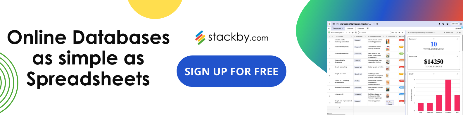
Best Google Sheets Dashboard Alternative: Stackby
Creating dashboards in Stackby is a seamless process that allows users to compile and visualize data from various sources in one centralized location. With Stackby's intuitive interface, users can easily design custom dashboards tailored to their specific needs.
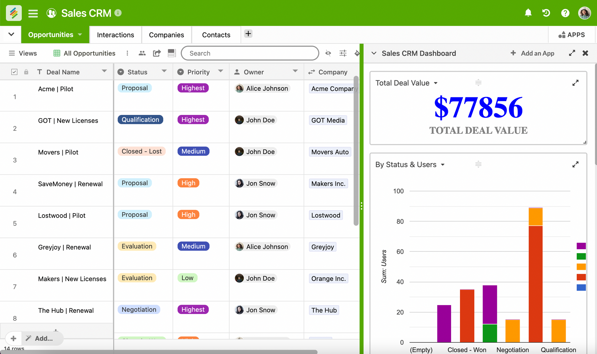
Stackby offers a range of powerful apps that can be added to dashboards to enhance data analysis and presentation:
1. Summary App: This app provides a concise overview of key metrics and insights, allowing users to quickly grasp the overall performance or status of their data.
2. Chart App: With the Chart App, users can transform their data into visually appealing charts and graphs, making it easier to identify trends, patterns, and correlations.
3. Pivot Table App: The Pivot Table App enables users to analyze large datasets by organizing and summarizing data in a customizable table format, facilitating in-depth exploration and comparison.
4. Time Tracking App: This app allows users to track and manage time-related data, such as project timelines, task durations, and resource allocation, ensuring efficient project management.
5. Page Designer App: The Page Designer App empowers users to create professional-looking reports and documents directly within the dashboard, incorporating text, images, and other elements for comprehensive data presentation.
In addition to these apps, Stackby offers a variety of other features to enhance data management and collaboration:
Views: Customize your data display with various view options like Gallery view, grid view, Kanban view, calendar view, and Custom forms builder providing flexibility in data visualization.
Grouping in Tables: Organize and structure your data effectively by grouping related information together within tables, simplifying navigation and analysis.
API Connectors: Seamlessly integrate external data sources and tools using API connectors, enabling real-time data updates and synchronization.
Automation: Streamline repetitive tasks and workflows with automation features, reducing manual effort and increasing productivity.
Mobile Apps: Access and manage your data on the go with Stackby's mobile apps for iOS and Android devices, ensuring flexibility and convenience for users working remotely or in the field.
Overall, Stackby offers a comprehensive suite of tools and features to empower users in creating dynamic and insightful dashboards for data analysis and decision-making.
Ditch Google Sheets Dashboards & Try Stackby today
In conclusion, Google Sheets provides a powerful platform for creating dynamic and interactive dashboards that can help businesses track and analyze key metrics effectively. However, when comparing Google Sheets Dashboard to Stackby Dashboard, Stackby offers a more intuitive and user-friendly experience with advanced features such as drag-and-drop interface, customizable widgets, and seamless integration with various third-party apps. While Google Sheets is a solid option for basic dashboard needs, Stackby Dashboard offers a more robust solution for businesses looking for enhanced functionality and ease of use in their data visualization efforts.
Sign up with Stackby for free today.
![A Simple Guide on Workflow Management Software [Updated 2026]](/blog/content/images/size/w960/2021/12/work-management-blog.png)
![Step by Step Guide on How to Build Forms in a Database [2026]](/blog/content/images/2022/03/form-database-blog.png)